Style Guide
The foundations, components, and sections this portfolio is designed and coded with.
Colors
| Name | CSS Variable | Value | Swatch | Usage |
|---|---|---|---|---|
| Background | --color-bg | #f7f7f7 | Page background | |
| White | --color-white | #ffffff | Cards, inputs | |
| Black | --color-black | #000000 | Display / H1 headings (Neutral Darkest) | |
| Coal | --color-coal | #0c0c0c | Primary text, buttons | |
| Foreground | --color-fg | #0c0c0c | Body text (alias of coal) | |
| Neutral Darker | --color-neutral-darker | #222222 | Secondary headings, eyebrows | |
| Neutral Dark | --color-neutral-dark | #444444 | Emphasised body text | |
| Neutral | --color-neutral | #666666 | Secondary text | |
| Muted | --color-muted | #6f6f6f | Secondary text, labels | |
| Neutral Light | --color-neutral-light | #8e8e8e | Tertiary text, placeholders | |
| Subtle | --color-subtle | #999999 | Tertiary text, placeholders | |
| Border | --color-border | #6f6f6f | Default borders | |
| Neutral Lighter | --color-neutral-lighter | #e6e6e6 | Light dividers, subtle borders | |
| Border Subtle | --color-border-subtle | #e5e5e5 | Light dividers | |
| Neutral Lightest | --color-neutral-lightest | #f7f7f7 | Subtle fills, hover backgrounds | |
| Green | --color-green | #8cee6f | Checkmarks, availability | |
| Yellow | --color-yellow | #ffc609 | Checkmarks, accents |
Typography
| Name | Font | Mobile | Desktop | Weight | Line Height | Tracking | Sample |
|---|---|---|---|---|---|---|---|
| Display / H1 | Instrument Sans | 56px | 92px | 500 | 1 | -0.05em | Build in code. |
| Heading 2 | Instrument Sans | 28px | 36px | 500 | 1.2 | -0.03em | Section Heading |
| Heading 3 | Instrument Sans | 28px | 40px | 500 | 1.2 | -0.03em | Subsection |
| Heading 4 | Instrument Sans | 24px | 28px | 500 | 1.2 | -0.03em | Sub-subsection |
| Heading 5 | Instrument Sans | 20px | 24px | 500 | 1.2 | -0.03em | Minor heading |
| Body | Instrument Sans | 16px | 16px | 400 | 1.4 | -0.02em | Body text for regular content and descriptions. |
| Lead | Instrument Sans | 18px | 18px | 400 | 1.4 | -0.02em | Lead paragraph text for introductions. |
| Small | Instrument Sans | 14px | 14px | 400 | 1.4 | 0 | Small text for footers and disclaimers. |
| Muted | Instrument Sans | 16px | 16px | 400 | 1.4 | -0.02em | Muted text for secondary info. |
| Tag / Label | Inconsolata | 16px | 16px | 400 | 1 | 0.05em | UPPERCASE LABEL |
Font Families
| Name | Family | CSS Variable | Usage |
|---|---|---|---|
| Sans | Instrument Sans | --font-sans | Body text, headings, UI |
| Mono | Inconsolata | --font-mono | Labels, tags, company names |
Spacing
| Token | Rem | Pixels | Preview |
|---|---|---|---|
| 1 | 0.25rem | 4px | |
| 2 | 0.5rem | 8px | |
| 3 | 0.75rem | 12px | |
| 4 | 1rem | 16px | |
| 5 | 1.25rem | 20px | |
| 6 | 1.5rem | 24px | |
| 8 | 2rem | 32px | |
| 10 | 2.5rem | 40px | |
| 12 | 3rem | 48px | |
| 16 | 4rem | 64px |
Border Radius
| Name | Value | Preview |
|---|---|---|
| sm | 0.375rem (6px) | |
| md | 0.5rem (8px) | |
| lg | 0.75rem (12px) | |
| xl | 1rem (16px) | |
| 2xl | 1.5rem (24px) | |
| card-img | 12px | |
| card-md | 16px | |
| card-sm | 20px | |
| card | 24px | |
| full | 9999px |
Shadows
| Name | CSS Value | Preview |
|---|---|---|
| Nav pill | 0 2px 8px 2px rgba(0,0,0,0.1), inset 2px 2px 0.5px -2px rgba(160,160,160,0.25) |
Transitions & Animations
| Name | Duration | Easing | Preview |
|---|---|---|---|
| fast | 150ms | ease | |
| normal | 200ms | ease | |
| slow | 300ms | ease | |
| fade-in | 600ms | cubic-bezier(0.16, 1, 0.3, 1) |
Entrance animations use .fade-in-ready / .fade-in-visible classes via ScrollReveal and FadeIn components. Entrance fades and the hero star play identically on every device, including phones in Low Power Mode (which reports prefers-reduced-motion); image shimmer still respects the preference.
| Variant | Size | Default | Hover | Active | Disabled |
|---|---|---|---|---|---|
| primary | small | Label | Label | ||
| primary | default | Label | Label | ||
| secondary | small | Label | Label | ||
| secondary | default | Label | Label | ||
| ghost | small | Label | Label | ||
| ghost | default | Label | Label |
Button Props
| Prop | Type | Default | Description |
|---|---|---|---|
| variant | primary | secondary | ghost | primary | Visual style |
| size | small | default | default | Size preset |
| href | string | - | Renders as Link or anchor |
| external | boolean | false | Opens in new tab |
Links
Text links share the site's hover language: an animated underline, or the FlipText slide. External links add a trailing arrow icon; section “more” links add a nudging arrow. Ghost buttons reuse the same FlipText hover.
| Variant | Classes | Usage |
|---|---|---|
| Text link | hover-underline | Breadcrumbs, inline links, footer credit |
| Flip link | group/flip + FlipText | Contact links, nav, ghost buttons |
| External link | FlipText + ExternalIcon (new tab) | Off-site links (LinkedIn, Notion) |
| “More” link | nudging → + FlipText | Section headers (See all work) |
Cards
Cards use an inline pattern. There is no Card component.
| Pattern | Classes |
|---|---|
| Base card | bg-white border border-coal/40 rounded-card p-[40px] |
| Stat card | bg-white rounded-[8px] p-6 md:p-[28px] flex flex-col gap-6 |
| Project card | bg-white border border-coal/40 rounded-card-md md:rounded-card overflow-hidden flex flex-col |
Card Title
Card description text goes here.
Badges & Tags
| Variant | Preview |
|---|---|
| Filter tag (inactive) | |
| Filter tag (active) | |
| Capability tag (static, non-interactive) | Design systems |
Checkmarks
| Variant | Color | Size | Usage | Preview |
|---|---|---|---|---|
| yellow | #ffc609 | 18x18px | Hero stat highlights | |
| green | #8cee6f | 18x18px | Hero stat highlights, availability indicator | |
| outline | #0c0c0c (border) | 16x16px | Project card highlights |
Image States
Every CMS image (case tiles, article cards, case-study covers and body images) renders through LoadingImage, never a raw <img>. Two visuals only: a shimmer means “still loading”; a static panel means “no image here”. A failed image retries once silently before falling back. Notion’s built-in gallery covers count as no cover.
| State | Visual | When | Preview |
|---|---|---|---|
| loading | .img-skeleton — neutral-lighter base, white sweep (1.6s); static under reduced motion | Until the image loads | |
| loaded | Image fades in over 700ms; shimmer fades out | On load | 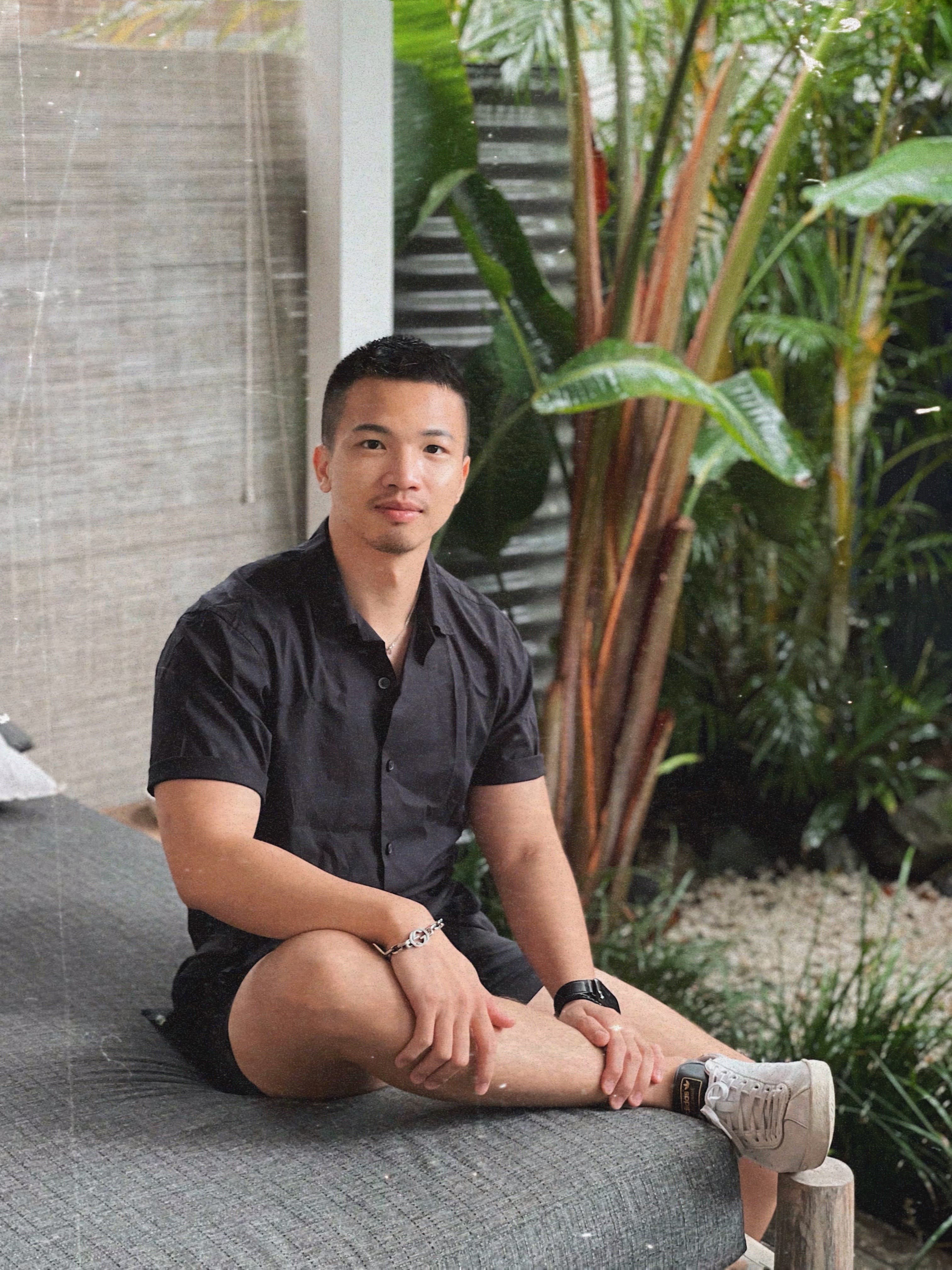 |
| empty | ImagePlaceholder — static neutral-lighter panel, muted image-off icon | No cover set, or still failing after one retry |
Form Inputs
| State | Preview |
|---|---|
| Default | |
| Filled | |
| Disabled | |
| Textarea |
Interaction States
Global Focus Ring
All interactive elements use outline: 2px solid coal with outline-offset: 2px on :focus-visible.
::selection
Text selection uses bg-coal text-white. Try selecting this text to see it.
Hover Effects System
Three reusable CSS classes define all hover interactions. Each uses cubic-bezier(0.16, 1, 0.3, 1) for a snappy, minimalist feel.
| Class | Effect | Used On |
|---|---|---|
| hover-underline | Animated underline slides in from left (0.3s) | Text links, breadcrumbs, ghost buttons |
| hover-lift | translateY(-2px) + subtle shadow (0.3s) | Primary buttons, CTA buttons |
| hover-lift-card | translateY(-4px) + larger shadow (0.3s) | Article cards, interactive cards |
| hover-float | transition transform 0.3s → tile-float keyframes on hover | Logo link and each header nav item |
| FlipText (group/flip) | Label is clipped to one line; on hover it slides up while an identical copy slides up from below (0.45s) | Header & mobile nav links |
Nav Link States
| State | Styles | Preview |
|---|---|---|
| Default | text-muted, 14px, hover:text-coal hover:bg-white/90 hover:border-coal/10 hover:shadow-[0_2px_6px_rgba(0,0,0,0.05)] | Work |
| Active | text-coal bg-yellow border-yellow shadow-sm | Work |
Filter Tag States
| State | Styles | Preview |
|---|---|---|
| Inactive | border-border-subtle, text-neutral-dark, rounded-md | Tag |
| Inactive + Hover | text-coal, border-border, bg-white | Tag |
| Active | bg-coal, text-white | Tag |
Header
| Property | Value | Description |
|---|---|---|
| position | sticky top-0 | Sticks to viewport top on scroll |
| z-index | 50 | Above all content |
| nav items | Work, About, Blog, Contact | On the home page Work / About / Blog anchor to in-page sections (#work, #about, #blog); Contact scrolls to the CTA |
| logo | md:h-10 w-10 (18×14 mark) | Compact 40px logo on desktop (56px tap target on mobile), 6px gap to the nav links |
| font size | 14px | Nav link text size |
| active state | bg-yellow border-yellow | Yellow pill for the active link; on the home page a scroll-spy highlights the section currently in view |
| scroll transition | IntersectionObserver, 80px sentinel, 700ms | Logo + links collapse together into one frosted white/80 + backdrop-blur-md pill with a subtle border & shadow on scroll |
| mobile menu | bg-white/95 border shadow-sm | Hamburger with animated bars → X morph |

| Property | Value | Description |
|---|---|---|
| layout | Single row, wrapped in ScrollReveal | Credit line left, copyright pinned right (flex, md:justify-between) |
| credit | 12px, text-muted, tracking-[-0.02em] | “Designed & built from scratch with Claude Code↑, using Notion↑ as the CMS. View the Style Guide” — external + internal links |
| copyright | 12px, text-muted, tracking-[-0.02em] | © Raygar He, {year}. All rights reserved — dynamic year via Date() |
This website was designed and built from scratch with Claude Code, using Notion as the CMS. View the Style Guide.
© Raygar He, 2026. All rights reserved
Hero Section
| Element | Description |
|---|---|
| Avatar | 140px mobile / 212px desktop circle, with ~40/53px star badge overlay |
| Name + Title | 40px mobile / 56px name; below it a 20px medium title line and a 14px muted location line |
| Stat Cards | 3-column grid: "0→1" (1 col) + "8+ years" (2 cols) with logos. Borderless bg-white rounded-[8px] cards |
| Highlights | Checkmark items with yellow/green variants |
| Animations | FadeIn (avatar) + FadeInWords (name/title) with staggered delays |
Raygar He
Senior Product Designer (AI, Web & Mobile Apps)
Based in Queensland, Australia — working globally
0 → 1
Lead end-to-end product design
8+ years
Across startups and enterprises
Case Tile
Vertical case-study card (shares the article-card shape): a cover screenshot on top at a 7:5 aspect (object-top), then a meta line (company · timeline), the project tagline, a short description, and a “View summary” link. Used in the home Work grid. Shows the shimmer while the cover loads and the static image placeholder when no cover is set (see Image States). The whole card is clickable: the CTA stretches over the card via an ::after overlay, so there’s still one link per card for keyboard and screen-reader users. Article cards and work cards follow the same pattern.
| Prop | Type | Description |
|---|---|---|
| company | string | Meta line, first item (14px, muted) |
| timeline | string? | Optional second meta item, ·-separated (from CMS) |
| tagline | string | Project title (16px medium, coal) |
| description | string? | Body copy (14px, muted) |
| cover | string? | Cover image (7:5, object-top); CMS page cover |
| cta | string? | Link label, falls back to “View summary” |
| href | string? | Card link target |
Building the systems to drive conversion.
Driving home loan conversion through a design system, experimentation practice, and research-led page experience.
Section Heading
The reusable heading that introduces the Work, About, and Blog sections on the home page.
| Property | Value | Description |
|---|---|---|
| eyebrow | font-mono 14px uppercase tracking-[0.8px] | Mono label above the section (SectionHeading title) |
| headline | 28px / 48px medium, tracking-[-0.03em] | Optional large statement below the eyebrow |
| more link | → label, bottom-right | Optional trailing link (arrow nudges, label underlines on hover); non-sticky, revealed via ScrollReveal |
Experience & Education
Résumé-style listing rendered inside a white card (rounded-[8px], p-7). Each row is a responsive grid divided by hairlines (divide-y divide-border-subtle); below xl the columns stack. In Experience, each position is a three-column row — role + tags, then the company, then period · location (right-aligned). The company name is shown once per company, so multiple roles at the same company read as a grouped block.
| Element | Style | Description |
|---|---|---|
| company / institution | 14px regular, black | Left column, emphasised proper noun |
| location | 12px regular, neutral | Follows the period on the same line (Experience); under the degree (Education) |
| title / degree | 14px regular, neutral-dark | Position title or qualification (right column) |
| period | 12px regular, neutral, right | Date range per position, shown as “period · location” (Experience only) |
| tags | capability tag — 12px, bg-neutral-lighter, rounded-md | Specialisation chips under each position (Experience only) |
Experience
ANZ
2026–Present·Brisbane
2024–Present·Brisbane
ADPList
2024–Present·Remote
Suncorp Group
2023–2024·Brisbane
2023–2024·Brisbane
Savvy
2021–2024·Adelaide
Jumbo Interactive
2022–2023·Brisbane
The Distillery
2021·Adelaide
JR Academy
2019–2020·Brisbane & Adelaide
Dogstar
2018–2019·Brisbane
Guangdong University of Foreign Studies
2014–2016·Guangzhou
Education
MSc Computer Science
University of Adelaide
Adelaide, Australia
BSc Interactive and Visual Design
Queensland University of Technology
Brisbane, Australia
Art & Design (Illustration)
Sheffield Hallam University
Sheffield, United Kingdom
Art (Graphic Design)
Guangdong University of Foreign Studies
Guangzhou, China
Digital Accessibility Certificates
Intopia
Online
CTA Section (ContactSection)
| Property | Value | Description |
|---|---|---|
| heading | 40px / 64px | “Let's connect.” — medium, white, responsive |
| card | bg-neutral-darker rounded-[8px] | Solid dark card, min-h-[360px] md:min-h-[520px], p-8 md:p-14 |
| CTAs | Text links (FlipText) | LinkedIn, Resume, Copy my email & Book a mentorship — 16px white/80 links, each wrapped in FlipText. A hairline divider sets Book a mentorship apart as the primary CTA |
| copy my email | clipboard action | Copies raygarhoo@gmail.com; swaps to “Email copied ✓” for 2s (aria-live). No external indicator |
| external indicator | trailing ExternalIcon + sr-only | Trailing ExternalIcon and “(opens in new tab)” on each external CTA — LinkedIn, Resume, mentorship (WCAG) |
| animation | ScrollReveal | Scroll-triggered entrance animation |
| visibility | Hidden on /styleguide | Also hidden on the 404 page; anchored at #contact (Header Contact link scrolls here) |
Sticky sidebar navigation used on About, Work detail, Article detail, and Styleguide pages. Highlights the active section as the user scrolls.
| Property | Value | Description |
|---|---|---|
| position | sticky top-24 | Fixed in viewport while scrolling |
| active indicator | border-l-2 border-coal | Left border highlights the active section |
| guide line | border-l border-border-subtle | Subtle vertical line connecting all items |
| heading | 10px / uppercase / tracking-widest / mb-4 | “On this page” label |
| item text | 12px | H2 link size; H3 sub-items are 11px, pl-7, prefixed with a “↳” glyph |
| items | Overview + headings | First item is always Overview; the rest are the case study's H2/H3 headings |
| width | w-[200px] | Fixed sidebar width |
| scroll offset | scroll-margin-top: 100px | Prevents sticky header from covering section headings |
| visibility | hidden md:block | Only visible on medium and larger screens |
On this page
- Overview
- Context
- ↳Problem framing
- Process
- Outcome
Password Modal
Clicking a password-protected case study opens this prompt as an overlay on the current page — no navigation. A correct password unlocks the case study (the unlock is remembered for the tab); Close, Escape, or a backdrop click dismisses it and leaves the user exactly where they were. The same PasswordPromptForm is reused by the inline gate shown on direct visits.
| Property | Value | Description |
|---|---|---|
| overlay | fixed inset-0 z-[100] | Portal to body; backdrop bg-coal/40 + 2px blur, click to close |
| panel | max-w-sm rounded-card-md p-8 | White card, border-coal/40, soft drop shadow |
| motion | fade + scale 0.96→1 | cubic-bezier(0.16, 1, 0.3, 1); fade-only under reduced motion |
| dismiss | Close ✕ / Esc / backdrop | Stays on the same page; no route change |
| no password | “Contact me for access” → #contact | 13px muted line below Unlock; closes the modal and scrolls to the Contact section (on every page). Also shown on the inline gate |
| a11y | role="dialog" aria-modal | Autofocus input, focus trap, scroll lock, focus restored on close |
Protected project
Enter the password to view this case study.
Don’t have the password? Contact me for access

Let's connect.
Raygar He, Senior Product Designer